Why User Onboarding is so important for customer retention
It’s almost impossible to move ahead without clear onboarding, which helps the user understand how the product works. So, to grow sustainably and scalability.
The fact is that after day one, your product retention will fall absurdly if nothing is done. A product that does not help the user to understand what it is for has very low engagement.
And that goes for any product, be it physical or digital. Try using something that is not designed for ease of use and self-explanatory. Remember when you bought something new and read the instruction manual before using the product.
User Onboarding ROI
Another issue is related precisely to the financial return. Working onboarding to help the user get started on your product greatly increases their likelihood of buying your product. Especially when working with easy entry products such as freemium or trial models.
In a recent Profitwell article, NPS notes showed thatcustomers who said they received good onboarding on a new product had between 12% and 21% more willing to pay than the median.Users who responded negatively were 3% to 9% willingness to pay, indicating that poor onboarding does not necessarily detract much, but surely your product may lose a good willingness to pay.
But this is where retention is where things get really interesting. When comparing the first 60 days of customers with poor perceptions of integration with those with positive perceptions, customers with positive perceptions fall much less in the first 21 days of a customer.
And they conclude the data indicate that good onboarding is essential to encompassing the value of a product with a customer or, at a minimum, mitigating the slippage your customer will get when you start using the product. Especially for him or her to begin to see the value, thereby significantly accelerating their journey.
What they are and for what they serve
I separated this article basically into two parts:
Part 1 — User Onboarding Principles
Part 2 — User Onboarding Best Practices
Principles are strategic, linked to concepts. While best practices are related to key actions in the product.
The basics will help you in decision making. When something is unclear whether you or your team is making the best decision for the user, come back and reflect on what you are doing through the perspective of these 3 principles.
Good practices are intended to help with what should be done. I emphasized 10 good practices I learned and tested over time. This does not mean that you have to employ it exactly this way, as it depends on each context and each product particularity.
In general, I believe that the principles and practices can help many companies, designers, product managers, and developers to create better products.
3 Principles of User Onboarding
1# Onboarding Obsession
The obsession with making your life easier and helping you get started using your product. Be obsessed with helping the user to get started autonomously without someone helping. If the user is unable to enter your software or get started on your product yourself, it is unlikely to engage. Know the reality of your users. You don’t want to design for an area you don’t know well.
2# Onboarding is not a metric: it is an outcome
That means we should not measure Onboarding, any of that. We must collect how many users are entering, what is the dropout rate, where is the “bottleneck” of our product, if any. All of this is obviously very important. The issue here is the metric is the consequence of a job. If you follow the first principle (user obsession), this will probably have a direct result on the result. And how to improve the results? Talk to your user continuously, do not miss this contact. Help your user the results will come.
3# Onboarding Must Be a Continuous Process for Business
It all starts and stays with the mindset that Onboarding is an ongoing process. Anything you look at can look from the perspective of Onboarding. Is this helping the user? Within his journey, is this moment clear to him? If at some point we stop looking at the user’s journey, what was simple becomes a complement and will need human help to be solved. This is closely linked to the day one mentality, every day is like your first day trying to help the user.
Best Practices for User Onboarding
These best practices could apply to any product. But we often see products that we really enjoy using.
1. Focus on the user’s goal
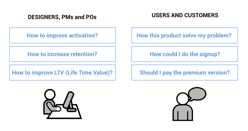
Understand your user/customer. Let’s play the basic. Understand who your customer is and what their aspirations, desires, and motivations are. Understanding this makes it a little clearer where to go, based on evidence and behavior from real users. In practice, start as early as possible by talking directly to your users and find the leanest way to find out if your idea really helps solve a real problem.
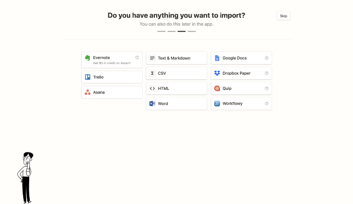
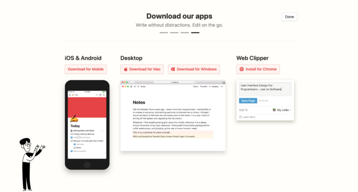
Use case: Notion.so
As a use case to illustrate good practice I chose to perform Onboarding of a product that is totally geared to the Product-Led Growth concepts: Notion.so. This software has the value proposition of being an all-in-one workplace: writing, planning, organizing and more.
2. Remove the frictions
Create experiences that are easy to understand and use. Identify what is not essential to perform the key action on your product. Initial barriers are responsible for giving up the user in the first steps. Consider whether what is being inserted helps the user achieve their goal or if it serves to solve a product problem. The paradigm shift here is to guide decisions to solve problems for users, even if the implementation is complex.
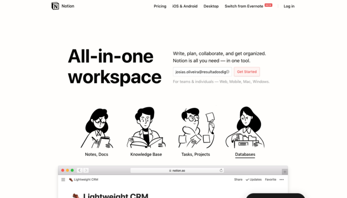

O Notion identifica o tipo de conta e solicita a autorização (se é uma conta Gmail, Hotmail, etc).
3. Customize onboarding
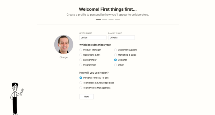
Single Onboarding is not for all your users. But for this you will need to contact your users and understand their behaviors and needs, customizing the journey according to each profile. If it is personalized, it gives a lot more confidence and he believes it is for him. There is even a theory in psychology that reports just that, when we offer something to a person there is an unconscious tendency to return that favor. And you can use the cheapest tool in the early versions, mainly to collect learning.
4. Few steps, very clear
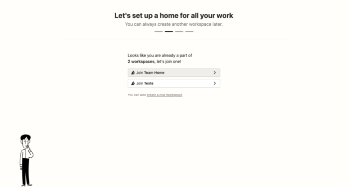
Decrease the cognitive effort and skill level that is required by the user in the first steps. Define what steps are required to perform the first actions on your product. Make it clear what skill level is displayed, what should be done, and most importantly, why it needs to be done. People like a reason. The combination of these factors helps to create simple and objective steps. Show a few steps at a time, if possible break into smaller tasks. A 10-step onboarding is a huge effort for the user and a waste of their business.
5. Anticipate the WOW moment
Think about the first thing your product can do for the user to create the first positive feeling of amazement or surprise. Anticipate the WOW moment. Work to deliver this moment as soon as possible, creating the first moments of positive emotion right from the first contact with your product. These small interactions create affective relationships with users.
6. Show, don’t tell
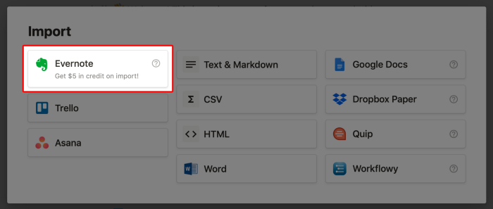
Whenever possible, be clear about the customer’s goal. The logic is to focus on what makes sense to the user about the problem he wants to solve, not what we want him to do. As a result, you will be able to work with a smaller amount of text, less text means less complexity. Communicate and ensure that everyone, within the moment of your journey, has the reasoning ability, skill and justification to perform the desired action.

7. Action Makes Sense While Educating
This interactive approach drives users to take meaningful actions while instructing them on how to use the software. In addition to making sense in the context where the element is inserted, it is essential that visually it is part of the UI composition. You see, we have to be careful not to be filling the interface with balloons and indications at all times, it’s nothing like that. Key actions need to be integrated with the interface and clear of the objective. Identify potential communication noises and resolve by educating action within the product.
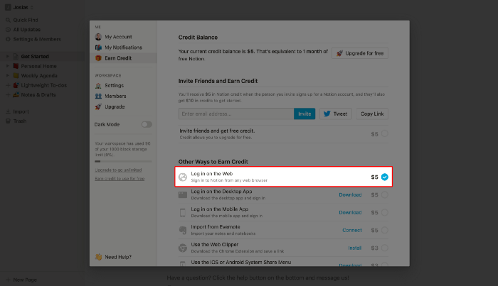
8. Give Rewards
Clearly understand what rewards prompt the user to proceed. If the user is able to move forward and is not properly rewarded for each cognitive effort that is required, the tendency is to leave most of them in the middle.
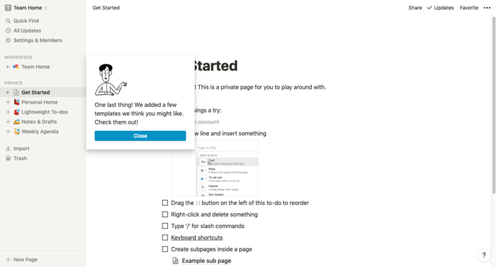
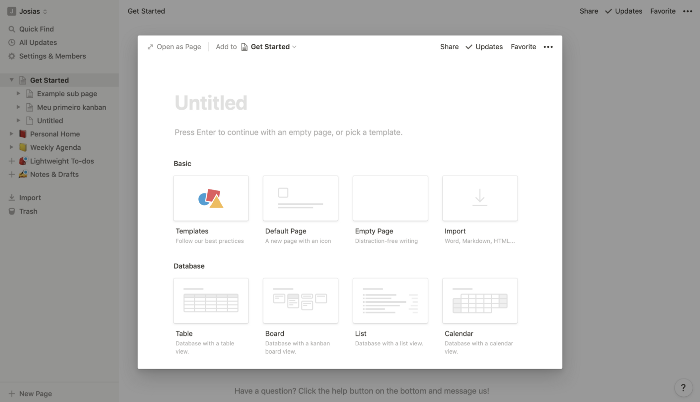
9. Templates to make the job easy
Templates help reduce the mental effort to create something. Doing the necessary key action is easier if we suggest how it can be used. Maybe without templates, the user will spend precious minutes thinking about something, while if we offer something ready according to their journey, it is easier to decide what to do. The idea was to create templates so easy to use that the user could just exchange the text for your company name and already publish your first content.
10. Show the next steps
After the action is completed, show the next steps. Clarify what immediate action the user should take if possible to align with that expectation. A list of tasks to complete creates a clear expectation of the completeness of what has already been done and the next interaction with your product.
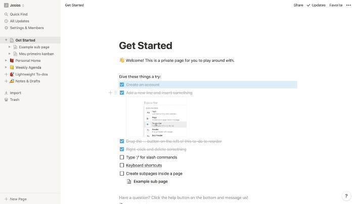
Human beings are conditioned to not like to leave lists that are unfinished or with things to do. So this is a good way to continue customizing the user experience while not completely eliminating the momentum in the first experience.
Conclusion
Onboarding is a process, a way of developing and looking at the product. It is how the user experiences a product and how it is guided through it. Good products have development and design teams obsessed with Onboarding.
References:


